Case Study: Coastal Campus Brewing Brand Identity Design


Client Overview
Project: Branding & Packaging for Coastal Campus Brewing
Designer: Abbey Girvan
Date: December 5, 2022
Course: DGL-202 Branding & Packaging
Client Brief: A clean, modern brand identity.
Coastal Campus Brewing is a student-led brewing program at North Island College, designed to educate future brewers while producing craft beer that appeals to locals. The project required a brand identity that reflected the program’s coastal roots, educational mission, and marketable appeal.
Objectives
- Brand Identity: Develop a distinctive logo and visual system that communicates the brewery’s coastal roots and educational focus.
- Packaging & Applications: Create cohesive label designs, stationery, and merchandise that align with the program’s goals.
- Typography & Colour Palette: Establish a refined yet approachable typographic and colour system that works across various applications.
- Flexibility: Ensure the design accommodates future growth, including a potential on-campus brewery and taproom.
Design Process
1. Research & Discovery
Client Brief Insights:
- Mission: “Making great beer and great brewers” – emphasizing education and community collaboration.
- Audience: Beer enthusiasts, students, and locals who support craft beer.
- Brand Personality: Inclusive, accessible, knowledgeable, and modern.
- Visual Preferences: Minimalist, clean, and sophisticated with subtle coastal references.
Competitor Analysis:
Admired breweries like Twin Sails, 33 Acres, and Four Winds influenced the balance of professionalism and craft appeal.
2. Mood Board & Conceptualization
Logo Inspiration:
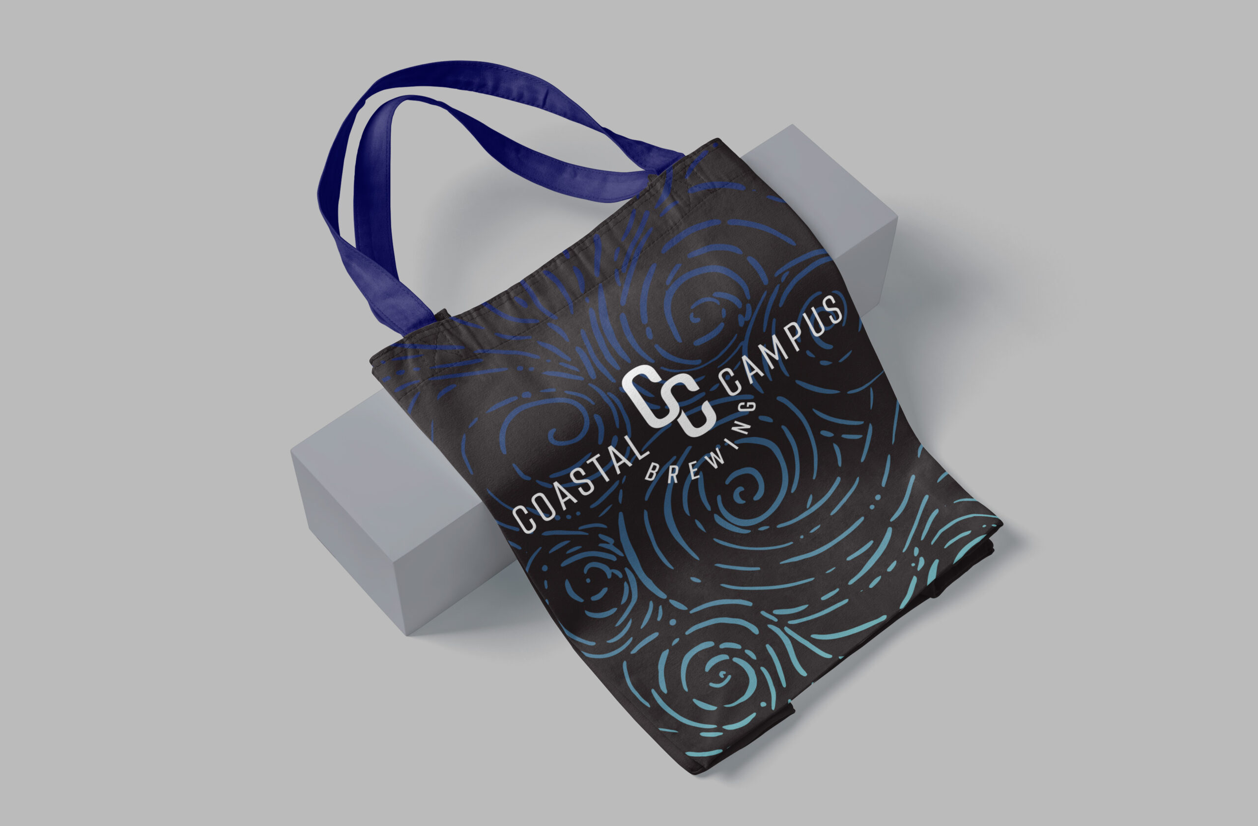
- Monogram Approach: A sans-serif monogram (“CC”) was chosen for scalability and readability on packaging.
- Subtle Coastal Motifs: Wave-like curves in the “C” letterforms and beer-tab-inspired shapes tied the design to Vancouver Island’s coastal environment.
Colour Inspiration:

- Dark Backgrounds: Used to stand out on shelves, with monochromatic bright accents for each beer variant.
- Primary Palette: Navy (#07074e), teal (#72cac3), and off-black (#231f20) for sophistication.
- Secondary Accents: Muted green, deep purple, and soft pink for versatility.
Pattern/Texture Inspiration:

- Topographic lines and wave-like abstractions referenced local landscapes while maintaining minimalism.
3. Logo Development & Rationale
Key Features:
- Wave-Integrated Monogram: The “C” curves mimic ocean waves, subtly reinforcing the coastal theme.
- Beer Tab Reference: Inner shapes nod to can tabs, linking the logo to the product.
- Versatility: Multiple lockups (full-colour, black-and-white) were created for labels, merch, and signage.
4. Colour & Typography System
5. Packaging & Applications
Beer Labels: Minimalist layouts with mandatory info (ABV, ingredients) and monochromatic accents.


Collateral: Business cards, advertising, and merch extended the brand.
Challenges & Solutions
- Balancing Education & Market Appeal: The design needed to attract students while competing with commercial breweries. Solution: A sleek, professional aesthetic with playful coastal touches.
- Flexibility for Growth: The logo had to transition from labels to a future taproom. Solution: Modular design with scalable elements (e.g., arched typography for large signage).
- Avoiding Clichés: Overly literal coastal imagery (e.g., waves, anchors) was avoided in favor of subtle details like the “C” curve.
Outcome
The final brand identity successfully merged education with craft beer culture, offering:
- A memorable monogram logo with hidden coastal and industry references.
- A refined colour system that felt both local and upscale.
- Adaptable applications across packaging, merch, and future brewery spaces.
The client praised the design’s balance of minimalism and personality, ensuring it would stand out on shelves while representing the program’s values.
Reflection
- Research-Driven Design: Aligning with client goals and competitor trends.
- Subtle Storytelling: Using hidden motifs (waves, tabs) to create depth.
- Systems Thinking: Designing for scalability from labels to physical spaces.
The project serves as a model for educational branding that doesn’t compromise on market appeal.
Final Thought: Coastal Campus Brewing’s identity proves that minimalism and meaning can coexist, creating a brand that grows with its audience.