Student Art Exhibition 2024 – Branding & Print Design
Project Overview
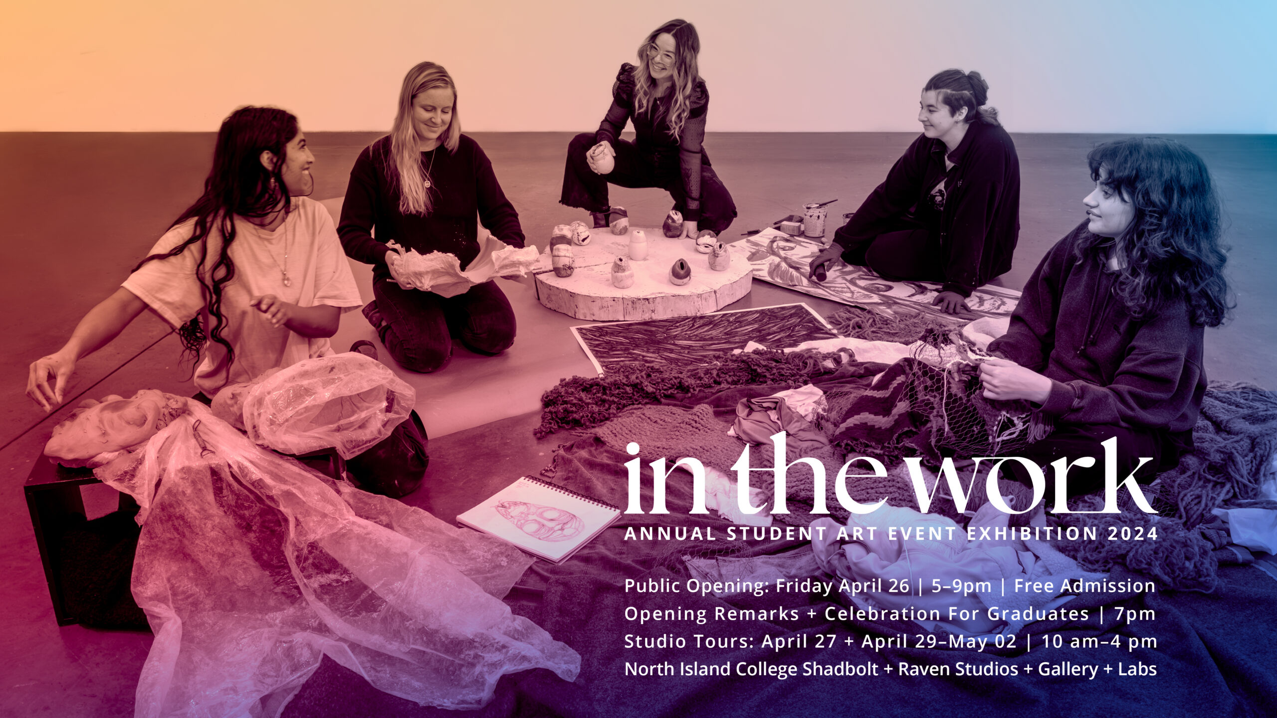
“IN THE WORK” is North Island College’s (NIC) annual showcase of emerging student artists. For the 2024 exhibition, I developed a clean, flexible visual identity that balanced institutional branding with artistic focus across five formats:
- 11″x17″ posters
- 8.5″x11″ posters
- 8.5″x5.5″ postcard
- Digital TV
- Digital mobile
Final poster tagline: “Annual Student Art Event Exhibition 2024”
Design Strategy
1. Minimalist Hierarchy
- Primary Focus: Bold “in the work” headline (custom typography) as the enduring brand mark.
- Secondary: Exhibition details in clean, unobtrusive sans-serif.
- Tertiary: NIC branding discreetly anchored at bottom.
“Public Opening: Friday April 26 | 5–9pm” was intentionally de-emphasized to keep attention on the art.
2. Reusable Visual System

- Typography: “in the work” set in a custom, scale-able word mark for future years.
- Layout: Modular grid to easily swap dates/locations annually.
- Colour: Pure CMY overlaying the poster image, creates visual interest without overwhelming the image.
3. Cross-Format Adaptations
- Print: Optimized bleed (5mm) and trim safety for posters/postcard.
- Digital: Simplified spacing for legibility on screens.
Key Design Decisions
| Challenge | Solution |
|---|---|
| Avoiding past years’ clutter | Strict 3-tier hierarchy |
| NIC branding requirements | Subtle placement at footer |
| Reusability | Custom “in the work” lockup |
Client Feedback
“The minimalist approach perfectly reflects our focus on student creativity. The modular system will save us hours in future years.”
— Angela, NIC Exhibition Coordinator
Results
5 formats delivered on schedule (March 28 print deadline)
Tools: Adobe InDesign (layout), Illustrator (word mark), Photoshop (photo prep)
View Final Poster:


